When designing well means designing for everyone
A look at universal design from NaviLens: why accessibility is not a patch added at the end, but the way of seeing that separates a correct project from one that changes lives.
Not so long ago, if you worked in graphic design your world fit on a desk: a Mac and a pile of color proofs on paper. We talked about the "information superhighway" as if it were the future, not quite believing how much it would actually change. And boy, did it change.
Today everything is instant. You look up a restaurant and you have the menu, the reviews, the route and the booking in thirty seconds. You arrive in a new city and your phone guides you without stopping to ask. Information has moved from being in specific places—newspapers, tourist offices, station boards—to being everywhere at once. And designers have spent the last two decades chasing that wave: from posters to screens, from thinking about the reader's eye to thinking about the user's finger, from printing to programming.
But in that race to digitise everything, we forgot something. Something rather big, in fact.
The gap nobody wanted to look at
While some of us celebrated each new screen, each new app, each new way to do things faster, there were people for whom that new world was not designed. Blind or low-vision people who suddenly found that their lifelong metro station—the one they knew by heart through its smells, sounds and the touch of the railings—had been refurbished and filled with bright screens displaying information they could not read. People with cognitive disabilities facing leaflets stuffed with text. Tourists who did not speak the local language and stood in front of a panel understanding nothing. Older people watching public services move to websites and apps they could not use.
We call all of this the digital divide, the accessibility gap, the language barrier. Three different walls, but similar ones: walls that separate those the information reaches from those who are left out.
And this is where design comes in. Because designing is not decorating. Designing is deciding who gets in and who doesn't. Every time you choose a font size, a contrast, a language, a symbol or a medium, you are letting some people in and leaving others out. Whether you do it consciously or not. And for many years, most of us have designed without thinking.
Accessibility is not a patch, it's a way of seeing
There is a common misunderstanding in our industry. Many people think accessibility is that final chapter of the project where you add a high-contrast version, tag the alt text on the images, and tick the box. One more layer, like putting a case on your phone.
But real accessibility doesn't work like that. If you leave it for the end, what comes out is a Frankenstein: a design conceived for a normative person to which you have then sewn on, by force, adjustments for everyone else. And it shows. Braille labels stuck like stickers in a corner. Audio descriptions that feel like footnotes. "Accessible mode" menus hidden in configuration submenus.
Universal accessibility—that slightly grandiose term that nevertheless describes the idea well—proposes something different. To design from the start with the understanding that the people who will use your thing are all different. Some see, some don't. Some read fast, others slowly. Some speak your language, others don't. Some are in a hurry, others patient. Some have their hands free, others are holding a child. If you design for that real diversity, what you get is better for everyone, not just for people with disabilities.
The classic example: curb cuts. They were made with wheelchairs in mind, but today they are used by strollers, rolling suitcases, delivery workers with their carts, older people who no longer elevator their feet as high. Everyone. That's universal design: a solution that doesn't single anyone out, that serves everyone.
Wayfinding, that invisible art
One area where this is crystal clear is wayfinding. Signs, arrows, airport icons, metro maps, museum notices. That layer of graphic information that organizes the physical world so people know where they are and where they need to go.
Good wayfinding is invisible. It does its job without you noticing. When you do notice it, it's usually because it's poorly made: because you got lost, because you had to stop and read it with effort, because you didn't understand the icon, because it was somewhere you couldn't see.
But that invisibility only exists if you belong to the group it was aimed at. If you don't see well, all the airport signs are invisible in another way: you can't use them. If you don't speak the language, same. If you have a cognitive disability and the icons are ambiguous, same.
That's where we designers have a huge challenge that is often not taught in school: knowing the parameters that make a sign genuinely usable by everyone passing in front of it. Minimum contrasts. Sizes relative to reading distance. Iconography tested with real studies, not just "pretty" ones. Combinations of channels (visual, auditory, tactile). Languages and translations. Redundant supports so that if one fails, another responds.
This is not being technical for the sake of it. It's being responsible with what you put out into the street. Because the wayfinding you design will be there for years. And thousands of different people will pass in front of it.
This is where NaviLens comes in
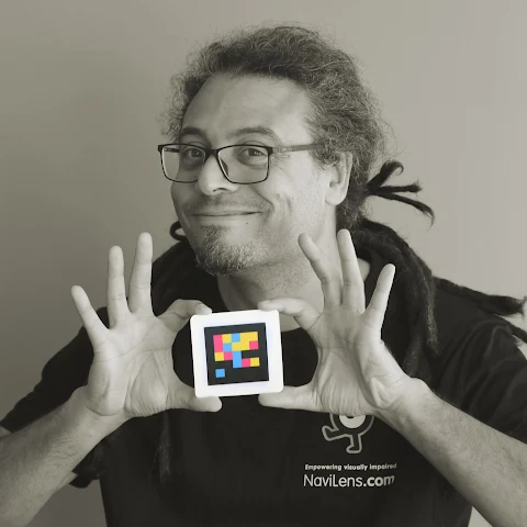
What we do at NaviLens was born precisely from this idea: what if a code placed on a wall could be read by anyone, without anyone having to point with precision, regardless of distance, angle or light, and delivering information in the language each person needs?
The starting point was both hard and simple. QR codes are a brilliant tool, but they ask for something many people can't do: see the code, get close to it, frame it precisely. For a blind person, finding a QR on a wall is like searching for a key you don't know where you dropped. And once you find it, the information it opens is usually a website designed for someone who sees. Accessibility, once again, as a patch.
NaviLens codes work differently. They are designed to be detected at distance—up to 100 feet—and on the move, without having to aim. The phone camera reads them even when you walk past, even when they are tilted, even in low light. And the associated information is delivered in the way each user needs: audio for those who don't see, simplified reading for those with cognitive difficulties, sign language for deaf users, automatic translation into more than forty languages for those who just got off a plane and don't know where they are.
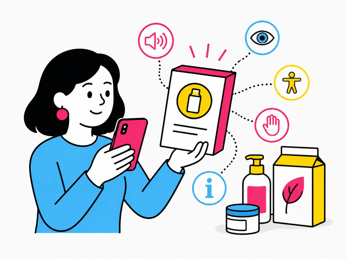
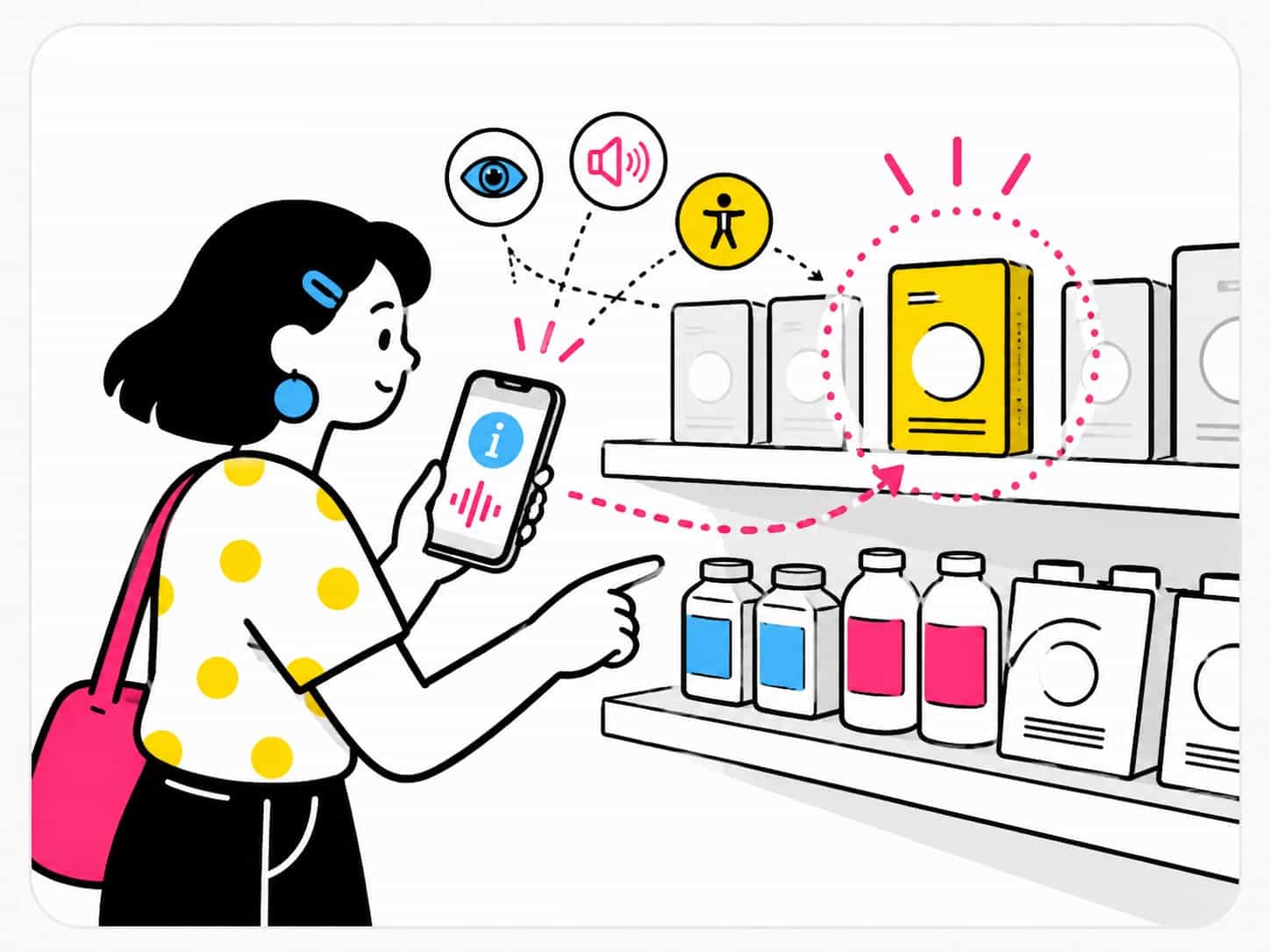
And here universal design returns with full force. NaviLens codes are not a solution just for blind people. They are a solution that starts there, in the most demanding case, and along the way solves many other things. The Chinese tourist arriving in Murcia who wants to know what's in the museum. The child who can't yet read and scans with their parent's phone. The older person who would rather have the sign speak than put on their glasses. The shopper with low vision who needs to know what's inside that supermarket package.
When you design with whoever needs it most in mind, what usually comes out also serves those you thought didn't need it. That's the beautiful part of working this way.
What we've learned along the way
We have spent years placing codes in very different places: metro stations in Madrid, Bilbao, Barcelona, New York, Munich. Venues like IFEMA or the Mobile World Congress. Consumer products on supermarket shelves. Museums, bus stops, hotels, trade fairs, city halls, hospitals, universities. Each rollout has taught us something.
And almost always the same thing, deep down: that accessibility is not a favor done for a particular group. It's a way to raise the quality of use for everyone. An accessible sign is a better sign. Inclusive wayfinding is more efficient wayfinding. A package with accessible information is a package with better-explained information, full stop.
When a brand like Kellogg's, Coca-Cola or L'Oréal incorporates accessible codes into its packaging, it is not doing "social marketing". It is making sure its product can be read, understood and bought by more people. It is widening its potential customer base. It is complying with regulations like the European Accessibility Act that come into force without asking permission. And along the way it is doing the right thing, of course. But here the right thing and the useful thing go hand in hand.
The designer's role today
Back to the beginning. If a few years ago the craft was about moving pretty pixels, today it's something more. Today, any self-respecting graphic designer has to know:
- That insufficient contrast leaves millions of people with low vision out.
- That a six-point body type on a medicine label can become a public health barrier.
- That icons that seem so clear to us can be a hieroglyph for someone with autism or a cognitive disability.
- That a gorgeous website can be literally unusable with a screen reader if nobody thought about it.
- That painting a museum wall cream looks very elegant but confuses anyone with partial vision loss.
Knowing these things is not being an accessibility expert. It's being a designer, today. Accessibility is not a separate specialisation you choose to pursue if the topic interests you. It's part of the craft, like knowing how to choose a typeface or use a grid.
And the good news is that the tools exist, the guidelines are written, and there are people—ourselves among others—who have been working for years so that those making accessibility decisions in their organizations have clear references, proven solutions and real cases to lean on. Accessibility has stopped being that vague topic discussed at the end of conferences. It's central. And it will be more so every year.
The future: that all of this stops being news
That's actually the goal. That a moment comes when writing an article like this sounds odd, because there is no longer anything obvious to defend. That a NaviLens sign, a package with accessible information or a station with audio description are no longer seen as "a pioneering initiative" but as normal. Like curb cuts. Like TV subtitles. Like the elevator.
Until then, those of us in this field will keep placing codes, training teams, publishing experiences, sometimes getting it wrong and always learning. Because every time a blind person walks alone into a station they didn't know and reaches their platform without help, or a tourist understands a new city without getting lost, or an older person buys the right product because the package finally speaks to them, all this work makes sense.
"Well-made design has that quality. You don't notice it when it works, but it changes lives quietly. And that's what this craft is about, in the end."
Thanks for reading this far. See you in the next article, if design allows it.